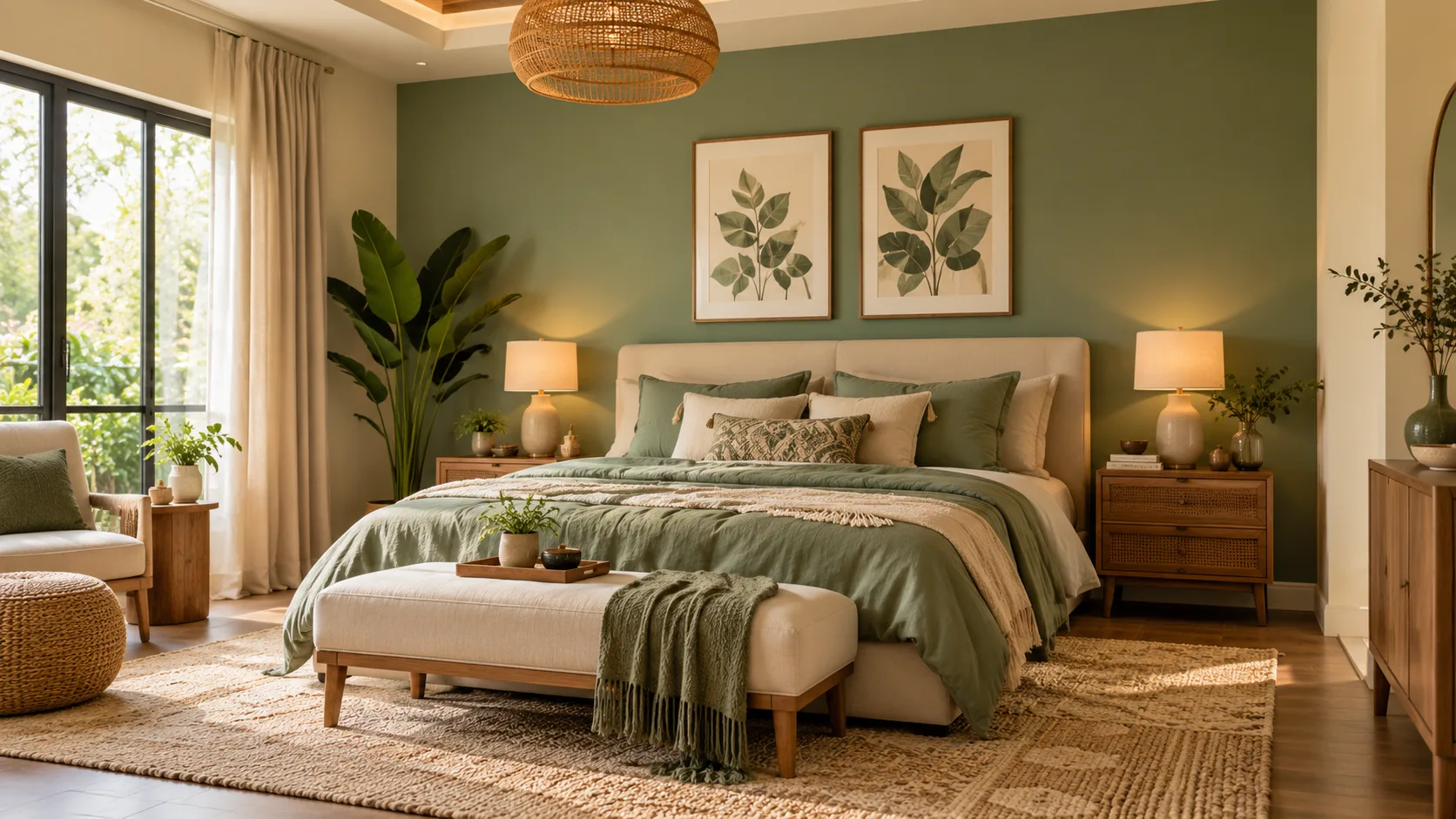
Choosing the right bedroom wall colours can completely transform the atmosphere of your personal space. The colours surrounding your bed influence how the room looks and feels, whether you prefer a peaceful retreat, a bright modern design, or a warm and welcoming environment. A thoughtful colour combination can also complement furniture, lighting, flooring, and decorative accessories.
Finding the perfect bedroom wall colour combination involves more than selecting two attractive shades. You need to consider room size, natural lighting, interior design preferences, and how different colours interact. From soft blue and white to elegant beige and brown, countless combinations can create a beautiful and comfortable bedroom.
Whether you are decorating a new bedroom or refreshing an existing space, selecting complementary colours can make the process easier. This guide explores popular bedroom wall colour combinations, modern design ideas, and practical decorating tips to help you create a space that reflects your personality.
Why Choosing the Right Bedroom Wall Colour Combination Matters
Bedroom wall colours play an important role in creating the visual atmosphere of a room. Light shades can make a space feel open and airy, while darker tones may create a cozy and intimate setting. Combining colours thoughtfully helps establish a balanced appearance that complements the bedroom’s overall design.
Wall colours also influence how furniture, flooring, curtains, and decorative accessories appear together. A well-planned colour scheme can connect different design elements and make the room feel more cohesive. For example, soft neutral walls may complement wooden furniture, while contrasting accent colours can highlight architectural details or a statement headboard.
Choosing colours based on personal comfort is equally important. Although some shades are traditionally associated with relaxation or energy, individual preferences vary considerably. The most successful bedroom colour combinations reflect your taste while creating an environment that feels comfortable for sleeping, reading, and everyday activities.
1. Blue and White – A Calm and Timeless Bedroom Combination
Blue and white is one of the most popular bedroom wall colour combinations because it creates a fresh, peaceful appearance. Soft blue shades introduce gentle colour, while white helps maintain brightness and visual balance. This combination works especially well in bedrooms where homeowners prefer a simple, comfortable, and timeless decorating style.
Light blue walls paired with white accents can create an airy atmosphere in small or medium-sized bedrooms. Deeper blue shades may also work beautifully when used on a single feature wall. White ceilings, bedding, and furniture can balance the darker colour while keeping the overall design visually appealing.
This combination complements several interior styles, including coastal, contemporary, and traditional bedroom designs. Natural wood, textured fabrics, and simple decorative accessories can add warmth without overwhelming the space. Choosing the right blue undertone is important because cool and warm lighting can change how the colour appears.
2. Beige and Brown – Warm and Elegant Bedroom Colours
Beige and brown create a warm bedroom colour scheme that feels natural, balanced, and welcoming. These earthy shades work together because they belong to a similar colour family. Beige provides a soft background, while brown introduces depth and visual interest through accent walls, furniture, or decorative details.
A light beige wall paired with a rich chocolate-brown accent can create a sophisticated appearance. Alternatively, sandy beige and warm taupe provide a softer combination suitable for minimalist bedrooms. Wooden furniture, cream bedding, and natural woven accessories can complement these shades beautifully.
Beige and brown are especially appealing for homeowners who prefer timeless interiors rather than bold colour trends. Their versatility allows them to work with both traditional and modern furniture. To prevent the bedroom from appearing too dark, balance deeper brown shades with adequate lighting and lighter decorative elements.
3. Sage Green and Cream – A Nature-Inspired Bedroom Design
Sage green and cream create a beautiful bedroom wall colour combination inspired by natural landscapes. Sage green introduces a muted botanical tone, while cream adds softness and warmth. Together, these colours produce a balanced appearance that works well in contemporary, rustic, and nature-inspired interiors.
Homeowners can use sage green on the wall behind the bed and apply cream to the remaining walls. This approach creates a subtle focal point without making the space feel visually overwhelming. Light wooden furniture, linen curtains, and natural textures can enhance the organic character of the colour scheme.
This combination is particularly attractive in bedrooms with good natural lighting, where the green undertones become more noticeable. Warm artificial lighting can also create a welcoming atmosphere during the evening. Adding decorative plants or botanical artwork can reinforce the nature-inspired theme without requiring extensive changes to the room.
4. Grey and White – A Modern Minimalist Bedroom Combination
Grey and white remain popular choices for modern bedroom interiors because they create a clean, simple appearance. White provides brightness, while grey introduces subtle contrast and depth. This combination is especially suitable for homeowners who prefer contemporary furniture, uncluttered spaces, and understated decorative elements.
Light grey walls paired with white trim can make a bedroom feel spacious and coordinated. Charcoal grey can also be used as an accent behind the headboard for a more dramatic design. White bedding, light curtains, and carefully selected artwork help maintain balance when darker shades are introduced.
Grey has different undertones, including blue, green, and warm beige, which can influence the final appearance. Selecting the right shade requires testing samples under the room’s actual lighting conditions. Warm wood, textured textiles, and soft lighting can prevent a grey-and-white bedroom from feeling overly cool.
5. Blush Pink and Light Grey – A Soft Contemporary Look
Blush pink and light grey create an elegant colour combination that feels soft without becoming overly decorative. Muted pink adds warmth and personality, while light grey provides a neutral foundation. This pairing works particularly well in modern bedrooms that feature simple furniture and subtle decorative accessories.
A blush pink feature wall can become the main visual element behind the bed, while pale grey keeps the remaining walls balanced. Alternatively, homeowners can use grey as the dominant shade and introduce pink through smaller painted sections. White ceilings and neutral flooring can help connect the two colours.
This combination can be adapted to different personal styles through furniture and accessories. Wooden accents create a warmer appearance, while black or brushed-metal details produce a more contemporary effect. Choosing dusty or muted pink shades often creates a more understated look than brighter, highly saturated alternatives.
6. Navy Blue and Beige – A Sophisticated Bedroom Colour Scheme
Navy blue and beige offer an attractive contrast between deep colour and warm neutrality. Navy adds visual depth, while beige softens the overall appearance and prevents the room from feeling too dark. This combination is particularly effective in bedrooms where homeowners want a refined design without using several competing colours.
A navy accent wall behind the bed can create a strong focal point, especially when paired with beige surrounding walls. Cream bedding, wooden furniture, and warm lighting complement the combination naturally. In larger bedrooms, navy may also be used more extensively when sufficient light and balanced furnishings are available.
The success of this pairing depends on maintaining the right proportion between dark and light surfaces. Using beige as the dominant shade often creates a brighter atmosphere, while navy provides definition. Simple accessories and carefully selected artwork can complete the look without introducing unnecessary visual clutter.
7. Lavender and White – A Fresh and Gentle Bedroom Design
Lavender and white create a light, attractive bedroom colour scheme that introduces personality without relying on strong contrasts. Soft lavender shades provide a delicate purple tone, while white keeps the space looking fresh. The combination works well in bedrooms designed around subtle colours, comfortable furnishings, and simple decorative details.
Homeowners can paint one wall lavender and keep the remaining walls white for a balanced appearance. A lighter lavender shade can also be used throughout the bedroom when paired with white ceilings and trim. Pale wooden furniture and neutral bedding provide additional warmth and help maintain a coordinated interior.
Lighting affects lavender significantly because its undertones may appear cooler or warmer at different times of day. Testing paint samples is therefore useful before making a final decision. Subtle floral artwork, textured cushions, and simple curtains can complement the colour scheme while preserving its understated character.
8. Terracotta and Cream – An Earthy Mediterranean Bedroom
Terracotta and cream create a warm colour combination inspired by natural clay, Mediterranean architecture, and earthy landscapes. Terracotta introduces a rich orange-brown tone, while cream balances its intensity. Together, these colours can make a bedroom feel welcoming and full of character without requiring elaborate decorative features.
A terracotta accent wall works beautifully behind a neutral upholstered headboard or simple wooden bed. Cream surrounding walls help maintain brightness while emphasizing the warm colour. Natural linen, woven baskets, ceramic accessories, and wooden furniture can complement the Mediterranean-inspired appearance.
Terracotta works particularly well with warm lighting and natural materials, although the exact shade should match the room’s overall proportions. Deep terracotta can feel visually strong in compact spaces, so using it selectively may create better balance. Softer clay tones provide an alternative for homeowners seeking a more subtle colour combination.
9. Olive Green and Beige – A Stylish Earth-Tone Combination
Olive green and beige offer a sophisticated bedroom colour palette inspired by nature. Olive introduces depth and an organic appearance, while beige provides warmth and softness. This pairing works especially well in rooms decorated with wooden furniture, natural fabrics, and understated accessories.
An olive green feature wall can create an attractive backdrop for a bed with cream or beige upholstery. The remaining walls can be painted in a warm neutral shade to maintain brightness. Textured curtains, woven rugs, and wooden bedside tables help create a coordinated bedroom environment.
Because olive green can contain yellow or grey undertones, choosing the right paint sample is important. Warm lighting may emphasize its earthy appearance, while cooler light can make it seem more muted. Selecting complementary beige tones helps ensure the finished room feels balanced rather than visually heavy.
10. Peach and White – A Bright and Welcoming Bedroom
Peach and white create a cheerful yet gentle bedroom colour combination. Peach adds warmth through its soft orange-pink undertones, while white provides freshness and contrast. This pairing can be particularly appealing in bedrooms where homeowners want a welcoming atmosphere without using very bold colours.
A muted peach accent wall can add personality behind a simple bed frame, while white surrounding walls help the room feel open. Light wooden furniture, cream textiles, and natural decorative materials complement the warm palette. Choosing softer peach shades can create a more subtle appearance than highly saturated alternatives.
The combination works well in contemporary, casual, and cottage-inspired bedrooms. Natural daylight can enhance peach tones, but strong warm lighting may make the colour appear more orange. Testing several samples under different lighting conditions helps identify a shade that suits the room throughout the day.
11. Charcoal Grey and Mustard Yellow – A Bold Modern Combination
Charcoal grey and mustard yellow create a striking bedroom colour scheme that combines depth with warmth. Charcoal provides a sophisticated neutral background, while mustard introduces an energetic accent. This pairing suits homeowners who enjoy contemporary interiors and want to create visual interest through contrasting colours.
A charcoal feature wall can make a strong statement behind the bed, while mustard may appear on a smaller painted section or complementary furnishings. Light grey or off-white surrounding walls can help maintain balance. Simple wooden furniture and warm lighting can soften the overall appearance.
Because both colours are visually distinctive, careful proportions are important. Using too much charcoal may make a small room feel darker, while excessive mustard can become overwhelming. A restrained approach allows the combination to appear coordinated and stylish without sacrificing the bedroom’s comfortable atmosphere.
12. Teal and Off-White – A Rich Contemporary Bedroom Look
Teal and off-white create a beautiful contrast between a saturated blue-green tone and a soft neutral background. Teal introduces character and depth, while off-white maintains a sense of brightness. This combination works particularly well in modern bedrooms where homeowners want a distinctive focal wall.
A deep teal accent behind the bed can complement light wooden furniture, cream textiles, and simple artwork. Off-white surrounding walls help prevent the room from appearing overly dark. For a softer alternative, muted teal shades can create a more understated appearance while maintaining the colour scheme’s visual interest.
Teal can shift between blue and green depending on lighting and nearby materials. Testing samples beside flooring, curtains, and furniture is therefore important. Warm neutral accessories and natural textures can help unify the design, creating a bedroom that feels both contemporary and inviting.
How to Choose the Best Wall Colours for a Small Bedroom
Choosing wall colours for a small bedroom involves considering natural light, furniture size, and visual balance. Light shades such as cream, warm white, pale blue, and soft beige can make a compact space appear more open. However, darker colours can also work when used deliberately with suitable lighting and furnishings.
A two-colour design can add interest without overwhelming the room. For example, one muted accent wall paired with three lighter walls creates a clear focal point. Keeping the ceiling light and selecting furniture that complements the wall colours can help maintain a coordinated appearance.
Small bedrooms do not have to be limited to white or other very pale shades. Personal preferences, room orientation, and decorative style should guide the final decision. Testing samples and observing how they appear throughout the day helps homeowners choose colours that make the space feel comfortable.
Best Two-Colour Combinations for Master Bedrooms
Master bedrooms often benefit from colour combinations that feel balanced and reflect the occupants’ preferences. Neutral pairings such as beige and brown, grey and white, or cream and sage green create versatile backgrounds. These combinations can accommodate different bedding, furniture, and seasonal accessories without requiring frequent repainting.
For a more dramatic appearance, navy and beige or charcoal and warm white can create an attractive feature wall. Darker tones may emphasize the bed as the room’s main focal point. Using lighter shades on the remaining walls can balance the design while allowing the stronger colour to stand out.
Choosing colours together with furniture and flooring is important because large surfaces strongly influence the overall appearance. A colour that looks attractive on a sample card may behave differently beside wooden flooring or upholstered furniture. Creating a consistent palette helps the bedroom feel visually connected and comfortable.
How Lighting Affects Bedroom Wall Colour Combinations
Lighting plays an important role in determining how wall colours appear inside a bedroom. Natural daylight changes throughout the day, while artificial bulbs introduce additional warm or cool tones. As a result, the same paint colour can look noticeably different depending on the room’s orientation and available lighting.
North-facing rooms in the Northern Hemisphere often receive cooler indirect daylight, which can emphasize blue or grey undertones. South-facing rooms generally receive stronger sunlight and may make warm colours appear brighter. However, window placement, surrounding buildings, and local climate can also influence the effect.
Testing paint samples on different walls provides a more reliable impression than choosing colours from a small printed chart. Observe the samples during morning, afternoon, and evening conditions. Checking colours alongside furniture and textiles helps ensure the final bedroom design remains appealing under the lighting you use most often.
Common Mistakes to Avoid When Choosing Bedroom Colours
One common mistake is selecting paint colours without considering the furniture and flooring already present. A shade may look attractive independently but clash with wooden finishes, curtains, or upholstered surfaces. Comparing samples with existing materials helps create a more harmonious bedroom design.
Another mistake is introducing too many competing colours into a relatively small space. Strong contrasts can work beautifully, but excessive colour variation may make the room feel visually disorganized. Limiting the main palette to two or three coordinated colours often creates a more consistent appearance.
Homeowners should also avoid relying entirely on digital photographs or paint charts when making final decisions. Screens and printed samples may not reproduce colours accurately under real lighting. Testing actual paint on the wall and allowing it to dry properly can prevent disappointing results and unnecessary repainting.
How to Match Bedroom Wall Colours With Furniture and Curtains
Matching wall colours with furniture begins by identifying the dominant tones already present in the room. Wooden furniture may contain warm yellow, orange, or reddish undertones, while painted furniture can introduce cooler colours. Selecting wall shades that complement these undertones helps create visual balance.
Curtains and bedding provide opportunities to connect different elements of the bedroom colour scheme. Neutral curtains can soften bold accent walls, while patterned textiles may introduce smaller amounts of complementary colour. Avoiding identical shades everywhere can create a more layered and interesting design.
The goal is not to make every object match perfectly but to create a coordinated palette. Mixing textures and varying the intensity of related colours can add depth without introducing visual confusion. A thoughtful balance between walls, furniture, and textiles helps make the bedroom feel complete.
Bedroom Wall Colour Trends and Timeless Design Ideas
Bedroom colour preferences change over time as interior design styles evolve. Earthy greens, warm neutrals, muted blues, and natural clay tones remain versatile options for homeowners interested in contemporary interiors. These shades often work well with wooden furniture and textured materials, making them adaptable to different decorating approaches.
Two-tone walls and subtle accent features can also create visual interest without extensive renovation. Homeowners may use contrasting paint behind the headboard or divide a wall into coordinated colour sections. These techniques allow greater personalization while maintaining an organized overall appearance.
However, a fashionable colour is not automatically the right choice for every bedroom. Personal taste, lighting, room proportions, and existing furnishings are more important than following short-lived trends. Choosing colours that remain enjoyable over time can make decorating decisions more practical and satisfying.
Conclusion
Choosing the right bedroom wall colour combination can transform an ordinary room into a comfortable and visually appealing personal space. From calming blue and white to earthy sage green and cream, different combinations offer unique decorating possibilities. The best choice depends on your preferences, natural lighting, furniture, and overall interior design style.
A successful colour scheme involves balancing dominant shades with complementary accents. Testing paint samples, considering room size, and coordinating surrounding materials can help prevent common decorating mistakes. Whether you prefer bold contrasts or subtle neutrals, thoughtful colour selection can create a cohesive bedroom appearance.
Ultimately, bedroom decoration should reflect your personality and make your living space feel welcoming. There is no single perfect colour combination for every home, and experimenting with different palettes can help you discover what works best. With careful planning, you can create a bedroom that combines visual beauty, everyday comfort, and lasting appeal.
Frequently Asked Questions (FAQs)
1. What is the best colour combination for bedroom walls?
Popular bedroom wall colour combinations include blue and white, sage green and cream, beige and brown, and grey and white. The ideal pairing depends on lighting, furniture, room size, and personal preferences.
2. Which two colours are best for a small bedroom?
Warm white and light blue, cream and sage green, or beige and off-white are attractive choices for small bedrooms. These combinations can create a bright, coordinated appearance without overwhelming limited space.
3. What bedroom wall colours create a relaxing atmosphere?
Soft blue, sage green, warm beige, lavender, and muted grey are commonly associated with peaceful bedroom designs. However, relaxation is personal, so selecting colours you genuinely enjoy is equally important.
4. Should bedroom walls be light or dark?
Both light and dark colours can work beautifully in bedrooms. Light shades often create an airy appearance, while darker tones add depth and coziness when balanced with suitable lighting and furnishings.
5. How many colours should I use in a bedroom?
Using two or three coordinated main colours is a practical starting point for most bedroom designs. Additional shades can appear through decorative accessories, but maintaining a consistent palette usually creates better visual balance.